As technology sprint towards sophisticated innovation, designers are embracing minimalism hoping to deliver experiences that offer better usability while maintaining a low profile. “Less is More” in reference to UX design is not about delivering a feature-heavy product, but making the product more leaner and amplifying its functionality. Minimalism promotes the philosophy that going the extra mile with design might not actually make the product better.
Minimalism is definitely becoming the new ‘mantra’ for pushing out simple, elegant and functional designs. The main principle of minimalism is to provide the only essentials to the user, everything presented on the screen is deliberate and useful. Hence reducing the time taken for the user to consider and decide on the options presented.
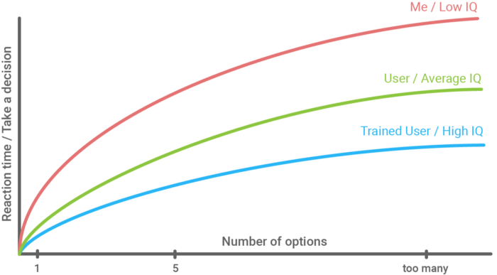
Hick’s law, or the Hick–Hyman Law, named after British and American psychologists William Edmund Hick and Ray Hyman, describes the time it takes for a person to make a decision as a result of the possible choices he or she has: increasing the number of choices will increase the decision time logarithmically.
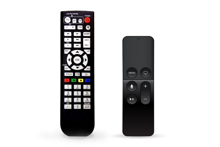
Designing for digital signage shouldn’t be any different. Reducing the number of options offered on screen can highly optimize the user’s approach to decision making. Too many options on screen will make the user overwhelmed and ultimately may quit the task they are attempting to accomplish. Reducing options and the steps in the process to make the task simpler or faster goes a long way in creating a positive experience, this could also prove to be very cost-effective as we would want the user to find what they are looking for and continue on to their destination.
However it’s not an easy task to approach digital signage screen design with a minimalist mindset. You have references such as websites, printed material and social media creeping in to your designs, overloading them with information. Carefully planning and only including the necessary information is crucial to achieving the objective. Some of the best practices include;
- Focus on the main element on the screen.
- Organizing or paginating content with the important on top and reducing less important to the layers.
- Minimizing the number of pages. (max of 3 layers)
- Reduce text like paragraphs and stories.
- Rely on visual representations like icons and glyphs.
- A very simple navigation system.
- Only incorporate functional animation.
Point to highlight from the above list is; striking excessive text from the screen ensures succinct, clear communication. When any page on the screen consists of only the most meaningful information in the most shortest way, you are more likely to get the message across. Users should not spend more than a moment trying to read everything on screen while they could have been on their way to fulfil the objective.
Additionally, Minimalism is not about taking away the artistic creativity to embrace a design skeleton. The concept should be about aligning your creative license with functional design. The ultimate objective of any digital signage design has to be to deliver the message with simplicity and ease.